Creative infographics turn ideas into simple visuals. They use images, icons, and short text to tell one clear story. They include key points that are easy to understand and remember, without clutter.
You do not need advanced design skills. Many tools provide templates, icons, and layouts that make the process easier.
Why Infographics Work: The Science of Visual Engagement
The Data Behind Infographics

Infographics help content reach more people and hold attention.
Content with infographics gets 178% more backlinks. More links mean more people find the content.
Posts with visuals see up to 650% more engagement. People stop scrolling when they see images or charts.
Businesses that use infographics see 12% faster traffic growth. That adds up over a year. Interactive infographics can help users engage more deeply with the content.
When users click and explore, they become active participants. Active users remember more and take action.
How the Human Brain Processes Visual Information
The brain does not simply record the world like a camera. The eyes only collect light. The brain builds meaning from it in seconds. Infographics work because the brain favors images.
Light enters the eye and hits the retina; then it turns into electrical signals.
Those signals move through the optic nerve to the brain. They pass through a relay point called the thalamus and reach the visual cortex at the back of the brain.
From there, the brain splits the work into two paths:
- The “what” path helps identify objects, faces, and colors.
- The “where” path tracks movement and location.
MIT researchers found that the brain can identify images seen for as little as 13 milliseconds. That helps explain why visuals can feel immediate and easier to process than long blocks of text.
8 Essential Types of Infographics (With Real Examples)
1. Statistical Infographics
Statistical infographics show survey results, research findings, and data reports. They focus on clear numbers and main trends.
They use pie charts, bar graphs, and line charts. This helps break large data into simple parts that are easy to scan and understand.
One example is the PowerFlex 2025 State of the Industry infographic. It used data from 400 corporate decision-makers. The infographic showed cleantech and ESG trends in a clear visual format.
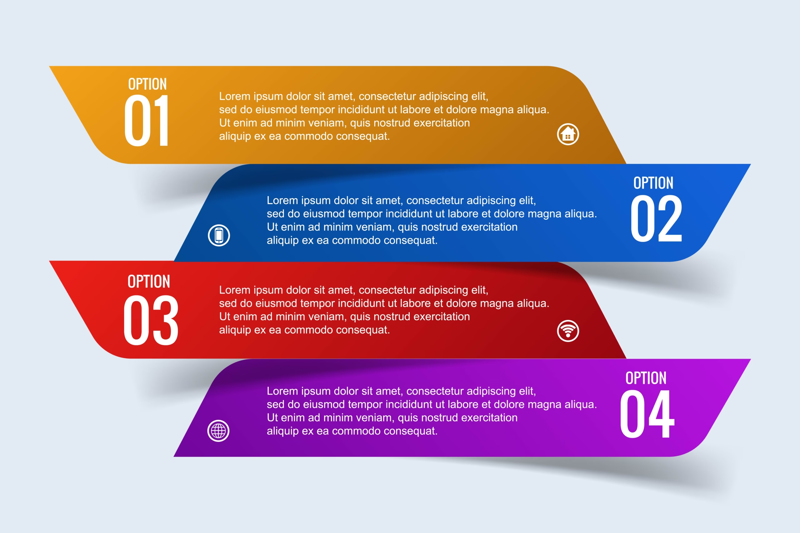
2. Informational Infographics
Informational infographics explain a topic in a simple way. They break down ideas into clear sections.
Each section uses short text and simple icons. The layout guides the eye from one point to the next. One key idea lives in each section.
A step-by-step infographic is a common example. It walks through a process. The reader sees each step clearly and remembers it later.
3. Timeline Infographics
Timeline infographics show events in order over time. They work well for company history, historical events, or project roadmaps.
They use a line, path, or connected points to show a sequence. This helps readers follow events in the order they happened.
A Pew Research Center example used alluvial diagrams to show how the American electorate changed from 2020 to 2024. Interactive versions allowed readers to explore how voter groups shifted over time.
4. Process Infographics
Process infographics show how something works step-by-step. They are used for recipes, DIY tasks, workflows, and software guides.
They break the process into clear steps. Numbers, arrows, or simple icons guide the flow from start to finish. Each step flows naturally into the next.
A common example is book publishing. It shows the full journey from manuscript submission to seeing the book on store shelves.
5. Geographic Infographics (Map Infographics)
Geographic infographics show data tied to locations. They are used for demographics, election results, sales regions, and public health data.
They use maps as the main visual. Data appears through color changes, heat maps, or points on the map. This helps show differences between regions.
A Stamen infographic for the World Health Organization showed global immunization data. It used maps and statistics to highlight areas with strong coverage and areas that needed more support.
6. Comparison Infographics
Comparison infographics show differences between two or more items. They work well for pros and cons, products, services, or ideas.
They use a side-by-side or split-screen layout. Icons, colors, and short points highlight key differences.
An American Express infographic compared “Gen Now” and “Gen Next.” It showed how workplace values and mindsets differ across generations.
7. Hierarchical Infographics
Hierarchical infographics show how information is ranked or structured. They are used for org charts, ranking systems, skill levels, or categories.
They use pyramids, tree diagrams, or nested boxes. Each level shows what is more important, higher, or lower in order.
An example is a pyramid chart that shows company management levels. Another example shows job skills ranked by importance.
8. List Infographics
List infographics turn simple lists into visual content. They work well for tips, facts, or resource lists.
They combine short text with icons, illustrations, or small visuals. Each point is shown clearly to make the list easier to read and share.
An example is “10 Ways to Reduce Plastic Use.” Each tip is paired with an icon to make the message clearer.
A Step-by-Step Guide to Creating Infographics:
A good infographic is not just about design. It follows a clear process. Each step shapes the message.
Step 1: Define the Core Message and Goal
Every strong infographic starts with a single idea. What’s the one thing people should remember after they see it? Get clear on that first.
The goal could be to inform, compare, persuade, or raise awareness. Pick one angle and stick
to it. A scattered message confuses people. A focused message is clear.
Step 2: Research and Gather Credible Data
Find facts that are true. Use government sites, research papers, or trusted surveys. Good data makes infographics more credible and helps build trust. Wrong data breaks it, even if the design looks good.
Step 3: Choose the Right Infographic Type
Pick the format based on your message:
- Use timelines for events over time.
- Use process infographics for step-by-step instructions.
- Use comparison layouts for differences.
- Use charts for data and numbers.
- Use maps for location-based insights.
Step 4: Create a Wireframe (Structure Before Design)
Plan the layout before opening a design tool. Write down the title, each section, and how the information will flow.
Decide what the viewer sees first and last. A strong creative infographic follows one clear path from start to finish.
Step 5: Design With Purpose (Key Elements)
A good infographic has five parts.
- Visual hierarchy: Use size and space to guide the eye. Headings stand out. Supporting text stays smaller.
- Data and facts: Show accurate numbers in simple charts.
- Graphics and icons: Use them to help the message. Do not clutter the page.
- Color and typography: Pick two to four colors. Choose fonts that are easy to read.
- Short text: Keep sentences brief. Break long ideas into bullet points or pictures.
Step 6: Design for Everyone
Good design works for all people. Pick colors with clear contrast. Use simple fonts. Keep the layout clean. This helps every reader see and understand the information.
Essential Tools to Create an Infographic:

1. Canva
Canva is best for beginners and non-designers who need quick infographics. It uses a drag-and-drop editor with ready templates, icons, and charts. You don’t need software installed. It works in the browser, so setup is fast and simple.
2. Piktochart
It is used for data-heavy infographics that still need a clean, simple look. It applies one theme across the design, adjusting colors and fonts in one step. Piktochart also includes maps and chart tools.
3. Venngage
Venngage is used for teams that need consistent branding across multiple designs. It saves brand details like logos, colors, and fonts. These settings apply to any new infographic.
4. Visme
Visme works well for interactive infographics used on websites or presentations. It adds clickable elements, hover effects, and video support to static visuals.
5. Adobe Express
Adobe Express is a practical option for people who need simple design tools with strong visual assets.
It includes free stock images and a one-click background remover for easy image placement.
Key Takeaway: What Are Infographics?
Infographics turn complex information into simple visuals that people can understand and remember quickly.
They work because the brain processes visuals faster than text, making information easier to absorb and act on. When used correctly, infographics improve engagement.
They also increase traffic and help audiences connect with ideas faster. In short, they help communicate information clearly in a fast-moving digital world.